LGC Typographic Scale Calculator
A visual typography tool to help you choose the right font size for your projects
CSS
:root {
/* Increase or decrease the number
to change the vertical spacing globally*/

/* Base Vertical Spacing */
    --space: ;

/* Vertical Spacing - multiplier */
    --vspace: calc(var(--space) * 1rem);
    --vspace-0: calc(3 * var(--space) * 1rem);
    --vspace-1: calc(2 * var(--space) * 1rem);
    --vspace-2: calc(1.5 * var(--space) * 1rem);
    --vspace-3: calc(0.5 * var(--space) * 1rem);
}

html {font-size: 16px;}

body {
    font-size: em;
    max-width: calc(25 * var(--vspace));
    margin: 0 auto;
}

p {
    margin: var(--vspace) 0;
    line-height: var(--vspace);
}

h1 {
    margin: var(--vspace-1) 0 var(--vspace-1) 0;
    line-height: calc(/var(--space)* var(--vspace));
}

h2 {
    margin: var(--vspace-2) 0 var(--vspace-3) 0;
    line-height: 1em;
}

h3 {
    margin: var(--vspace-1) 0 var(--vspace-3) 0;
    line-height: 1em;
}

h4, h5, h6 {
    margin: var(--vspace-2) 0 var(--vspace-3) 0;
    line-height: var(--vspace);
}

.bigtitle, h1 {
    font-size: em;
    word-break: break-word;
}

.title, h2 {
    font-size: em;
    font-weight: lighter;
    word-break: break-word;
}

.subheading1, h3 {
    font-size: em;
    font-weight: normal;
    text-transform: uppercase;
    letter-spacing: .1em;
}

blockquote {
    font-size: em;
    font-style:italic;
    line-height: calc(*var(--vspace));
    margin: var(--vspace-2) var(--vspace-2);
}

.subheading2, h4 {
    font-size: em;
    text-transform: capitalize;
}

.subheading3, h5 {
    font-size: em;
    font-weight: lighter;
    text-transform: uppercase;
    letter-spacing: .15em;
}

.subheading4, h6 {
    font-size: em;
    font-weight: normal;
    font-style: italic;
    font-family: "le-monde-livre-classic-byol",serif !important;
    letter-spacing: 0px!important;
}

.caption_ts {
    font-size: em;
    font-weight: normal;
    font-style: italic;
}

.endnote_ts {font-size: em;}

.footnote_ts {
  margin: var(--vspace-0) 0 var(--vspace-2) 0;
  font-size: em;
  border-top: 1px solid #ccc;
  line-height: 2em;
}

sup {
    font-size: rem;
    margin: .5em;
    text-transform: none;
    font-style: italic;
    font-weight: normal;
}The Little Blind TextH1
World of GrammarH2
Far far away, behind the word mountains, far from the countries Vokalia and Consonantia, there live the blind texts. Separated they live in Bookmarksgrove right at the coast of the Semantics, a large language ocean. A small river named Duden flows by their place and supplies it with the necessary regelialia. It is a paradisematic country, in which roasted parts of sentences fly into your mouth. Even the all-powerful Pointing has no control about the blind texts it is an almost unorthographic life One day however a small line of blind text by the name of Lorem Ipsum decided to leave for the far World of Grammar. The Big Oxmox advised her not to do so, because there were thousands of bad Commas, wild Question Marks and devious Semikoli, but the Little Blind Text didn’t listen.
Italic MountainsH3
When she reached the first hills of the Italic Mountains, she had a last view back on the skyline of her hometown Bookmarksgrove, the headline of Alphabet Village and the subline of her own road, the Line Lane. Pityful a rethoric question ran over her cheek, then she continued her way. On her way she met a copy. The copy warned the Little Blind Text, that where it came from it would have been rewritten a thousand times and everything that was left from its origin would be the word "and" and the Little Blind Text should turn around and return to its own, safe country.
The BookmarksgroveH4
She packed her seven versalia, put her initial into the belt and made herself on the way. When she reached the first hills of the Italic Mountains, she had a last view back on the skyline of her hometown Bookmarksgrove, the headline of Alphabet Village and the subline of her own road, the Line Lane. Pityful a rethoric question ran over her cheek, then she continued her way. On her way she met a copy.
"The copy warned the Little Blind Text, that where it came from it would have been rewritten a thousand times and everything that was left from its origin would be the word "and" and the Little Blind Text should turn around and return to its own, safe country."
But nothing the copy said could convince her and so it didn’t take long until a few insidious Copy Writers ambushed her, made her drunk with Longe and Parole and dragged her into their agency, where they abused her for their projects again and again.
Vokalia and ConsonantiaH5
And if she hasn’t been rewritten, then they are still using her. Far far away, behind the word mountains, far from the countries Vokalia and Consonantia, there live the blind texts. Separated they live in Bookmarksgrove right at the coast of the Semantics, a large language ocean. A small river named Duden flows by their place and supplies it with the necessary regelialia. It is a paradisematic country, in which roasted parts of sentences fly into your mouth.
The Far World of GrammarH6
Even the all-powerful Pointing has no control about the blind texts it is an almost unorthographic life One day however a small line of blind text by the name of Lorem Ipsum decided to leave for the far World of Grammar. The Big Oxmox advised her not to do so, because there were thousands of bad Commas, wild Question Marks and devious Semikoli, but the Little Blind Text didn’t listen. She packed her seven versalia, put her initial into the belt and made herself on the way.
- 1. A small river named Duden flows by their place.
- 2. Pointing has no control about the blind texts.
The typographic scale is an ordered set of character sizes linked to each other by a common ratio. Choosing font sizes from a type scale is essential for creating consistency, harmony, and contrast in a typographic work. Robert Bringhurst, in his book 'The Elements of Style,' says that no one should compose without it.
Design software usually has such a scale. Adobe InDesign's default sequence is based on the Classic Typographic Scale which is 6, 7, 8, 9, 10, 11, 12, 14, 16, 18, 21, 24, 36, 48, 60, 72, and so forth. This type scale has historical significance — used by typographers of the early Renaissance; it has remained unchanged for 400 years.
In the time when types were cut in metal, these font sizes were chosen for practical reasons. The typographers settled with a small range of sizes. And since they needed a greater variety of small fonts, the scaling ratio between the smaller font sizes was smaller than for the larger font sizes. The small sizes would increase by +1 (size 6 to 12), then the next series would increase by +2 (size 12 to 18), then by +3 (size 21 to 24), then by +12 (size 24 to 72), and so on.
If we assume the existence of a mathematical equation, the closest would be a1=round (a × r), where a=12 and r=5√2. This equation produces the following sequence: 6, 7, 8, 9, 10, 12, 14, 16, 18, 21, 24, 28, 32, 36, 42, 48 and so forth. Very close isn't it? This contains all the numbers of the Classical Typographic chart except 11. This equation uses two defining properties a and r.
Harmonious Proportions
It is believed that certain proportions appeal to our eyes for the same reason that musical harmonies please our ears. Not surprising that they share some attributes. As Owen Gregory notes: "Both have formal qualities or parts that can be abstracted, analysed and discussed, often using the same terminology: composition, harmony, rhythm, repetition, form, theme; even colour, texture and tone."
If we look at a musical scale, we note that it has three defining properties; the root note, the number of note in the scale and the interval ratio. And we take notice that the ratio of frequencies of two notes an octave apart is 2.
Let's rework the equation so that it resemble the musical scale, with three defining properties, and r=2 to match the ratio of frequencies of the octaves. We will use a=12pt as the fundamental term. In the Classical typographic scale chart, five steps separate the 12 and 24, so we will presume that it is a pentatonic scale (with five notes). Thus, our three properties are r=2, a=12pt and n=5. Using the geometric progression formula, we obtain the following sequence 6, 7, 8, 9, 10, 12, 14, 16, 18, 21, 24, 28, 32, 36, 42, 48, 55 etc. We can see that this is identical to the previous sequence.
Modular Scale Type Tools
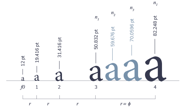
Tools like Tim Brown's modularscale.com and Jeremy Church's type tool can generate a sequence of font sizes with a particular geometric incrementation ratio. However, these tools are limited to a simple modular scale with two defining properties. For instance, with a base a=12pt, and r=ϕ, using the equation a1=round(a × r), we obtain the following sequence: 12, 19, 31, 51, 82, ... Nice! However, as we can see, this results in an increase in font sizing with too much amplitude.
Our typographic scale calculator generates a modular scale using three defining properties similar to the musical scale: The initial term (a), the increment ratio (r), and the number of sizes in the type scale (n). With a value of a=12pt, r=ϕ and n=3, we get more option in the sequence: 12, 14, 17, 19, 23, 27, 31, 37, 43, 51, and so forth. Having these intermediaries, which in music would be equivalent to the notes between the octaves, results in a smoother sizing and more options for the designer. The designer can choose the right font sizing.
Composing
In addition, our type-scale calculator gives the designer the ability to assign different typographic elements (title, subtitle, legend, etc.) to any term in the sequence.
The seasoned users can try to replicate the musical scale, e.g. assigning the value 8 of a chromatic scale to the title would amount to a dominant fifth (+7 semitones) in a musical scale, entering 13 would be equivalent to the perfect octave (+12 semitones), 25 would be a double octave (+24 semitones), and so forth. The sequence 1, 3, 5, 6, 8, 10, 12, 13, 14, 16, 18, 19, 21, 23, 25, etc., would be equivalent to the major scale, and so on.
The rest of us can simply experiment with any interesting growth scale, i.e. the Fibonacci Sequence (1, 2, 3, 5, 8, 13, 21, ...), the Lucas Numbers (1, 3, 4, 7, 11, 18, ...), the Pentagonal number Series (1, 2, 5, 7, 12, 15, 22, ...), or any other fabulous sequences.

Fig. 1. Base (f0)=12pt • Common ratio (r)=1.618 (ɸ)
• No. of elements in scale (n)=3
References & Similar Projects
-
The Elements of Typographic Style by Robert Bringhust
-
Composing the New Canon: Music, Harmony, Proportion by Owen Gregory
-
Typographic Scale by Simonsen Spencer
-
Modular Scale by Tim Brown
-
Jeremy Church's Type Scale
